How to Interpret Flow Cytometry Data
The experiment is complete. The samples have been run through the flow cytometry machine. Now it’s time for the fun part, examining the results of your experiment!
Flow Cytometry Provides a Wealth of Data
Flow cytometry is unique from other common benchtop assays in that it collects data at the individual cell level, making each sample a wealth of information. Each cell is processed as a distinct event and multiple pieces of information are collected as it travels through the discrimination point of the cytometer. Data on light scatter, both forward and side, along with fluorescence are collected. Advances in flow cytometry are making five to ten color panels common experimental practice with fifteen to thirty color panels becoming increasingly popular especially with advancements in spectral flow cytometry. This means that you can have anywhere from two to thirty-plus pieces of information for each of the 10,000 or more events (cells) processed from each sample. Making sense of all this data may be intimidating, but there are some principles about flow cytometry data that are consistent across the board.
Include Appropriate Controls
How you interpret your data is highly dependent on your experimental design. Including appropriate controls may have a huge impact on your subsequent data analysis and the comparisons that you are able to make. Taking the time to critically evaluate the goals of the experiment and what samples and controls are needed to make appropriate and definitive conclusions may save time and confusion during the data analysis process.
Develop a Gating Strategy
Flow cytometry data is typically depicted in one of two formats: a histogram or a scatter plot.
Histograms
Histograms are used to graphically present single-parameter data. This type of data represents a single piece of information which, in flow cytometry, is often fluorescence intensity or forward scatter. The most common histograms in flow cytometry analyses display signal intensity on the x-axis and count on the y-axis. As the peak of the histogram moves from left to right, signal intensity is increasing. In the case of fluorescence, shifting of the peak to the right indicates increased fluorescent levels correlating to higher expression of the target detected by this fluorescent marker. Histograms displaying the same information (e.g. PE fluorescence) can be overlayed onto a single histogram to pictorially compare two different samples.
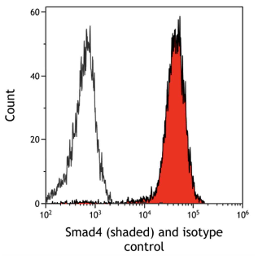
Figure 1 is an overlay comparing fluorescence levels of Smad4 to isotype control. In this example, there is a shift to the right for the fluorescence intensity of Smad4 as compared to the isotype control. We can express this fold-induction as relative fluorescence intensity by calculating a ratio between the fluorescence intensity of Smad4 and the isotype control. Relative fluorescence intensity allows for comparisons to be made across different sample types and even experiments. This measurement takes into account differences in background fluorescence between different cell types and potential experimental variation.
Scatter Plots
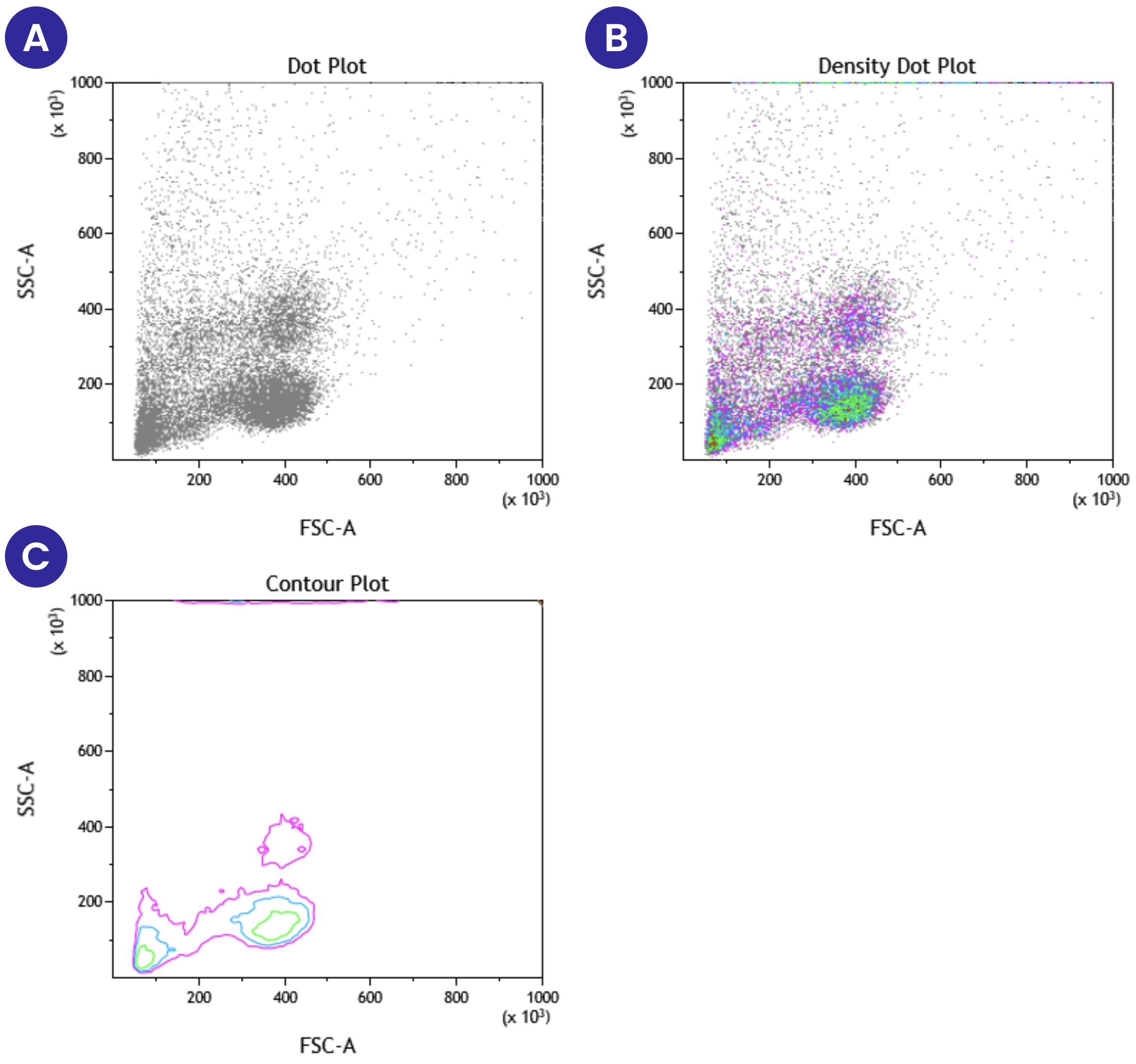
Scatter plots are the other common format to display flow cytometry data. They are used to present multiparameter data. Scatter plots are forms of dot plots, where each event that passes through the flow cytometer is mapped onto the graph based on expression of the specific parameters being examined. One key scatter plot that is commonly used at the initial stages of data analysis displays forward scatter against side scatter. This scatter plot is used to gate target cell populations for subsequent analysis. This gating can be done by carefully selecting the cell population of interest based on known cell properties or by identifying debris and selecting everything else.
Figure 2 below shows three different formats of scatter plots that display forward vs side scatter of peripheral blood mononuclear cells. Panel A represents the standard dot plot where each event is placed on the graph based on its forward scatter and side scatter properties. In this plot, all the events are shown in the same color. Panel B shows the same information as A, except now we have added different colors based on the density of cells present at a specific location on the plot. Density plots provide additional information that can be lost or harder to see in a single-color dot plot. Panel C shows a contour plot, with the same information as Panels A and B, but only areas with high event counts are displayed on the contour plot.
Deciding How to Analyze Your Flow Cytometry Data
In addition to plotting forward and side scatter, these graphs can show the expression of two different fluorescent markers on the same cell population. Figure 3A below shows an example scatter plot where events are displayed based on the expression of both CD3 and CD4. The fluorescent marker FITC was used to detect CD3 expression levels and APC was used to detect CD4 expression levels. This scatter plot is divided into quadrants based on the differential expression of CD3 and CD4. The bottom left quadrant shows the events that have either low or no expression of either CD3 or CD4. The top left quadrant shows events that are positive for CD3 but not CD4, and the bottom right quadrant shows events that are positive for CD4 but not CD3. Finally, the top right quadrant shows events that are CD3 and CD4 double-positive. In comparing the information gathered from this scatter plot (Figure 3A) to that which we learn from histograms of CD3 (Figure 3B) or CD4 (Figure 3C), we see a much more detailed picture. Using the scatter plot, we learn the number or percentage of events that are positive for both CD3 and CD4, along with the events that are CD3+CD4- and CD4+CD3-. With the histograms, we only learn the number or percentage of events that are either CD3+ or CD4+, and we cannot learn anything about the expression of both markers on the same event.
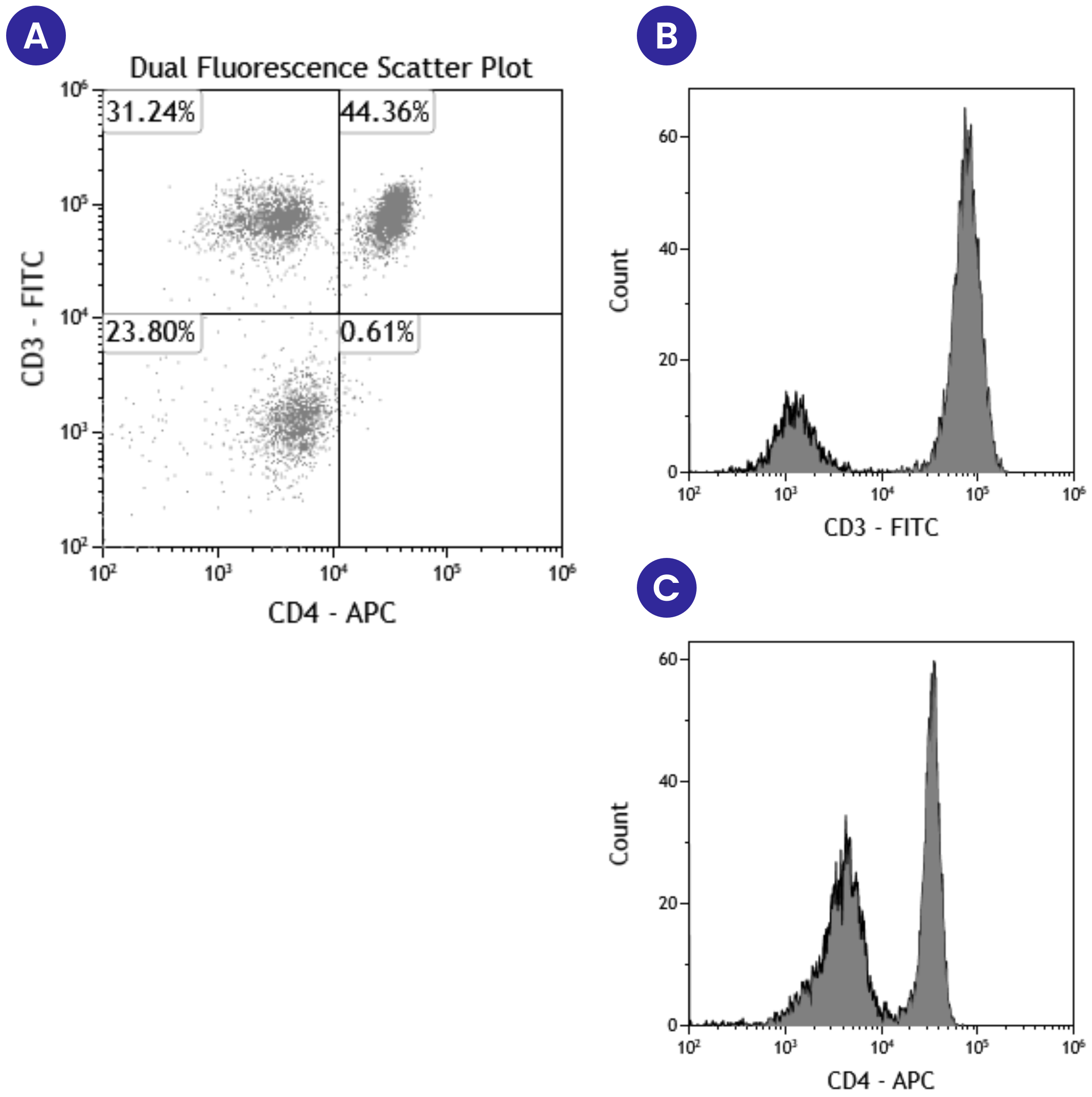
While both pieces of information are useful, you as the experimenter need to determine when to use single versus multiparameter data representations and analysis. And regardless of which method you use, it is good practice to include representative scatter plots and histograms with your data in posters and publications. This allows readers to have a visualization of the data and be more convinced of signal intensity differences.
Conclusions
Complex gating strategies and the plethora of color combination possibilities may make flow cytometry data analysis complicated. However, remembering these principles behind histograms and scatter plots will help you to be successful no matter how complicated your experiment.